Monday, March 15, 2010

Designer's source for DIY


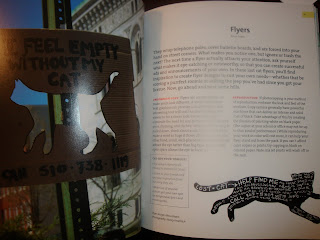
D.I.Y. Design it yourself. a book. By Ellen Lupton, Program Director of MFA in Graphic Design at Maryland Institute College of Art.
For me this will come in handy, because I basically have no clue how to do a lot of design projects and although working out the problems along the way seems like the honorable thing to do, it may have more risk than reward in some circumstances. Insert D.I.Y. to your home library. Problem solved.
The book gives ideas on how to bind books, create easy blogs, logos, business cards, cd's...everything you need to know to be a starting designer.
D.I.Y is a revolution empowering everyday people to become more aware and engaged in design culture. So watch out professionals!

Monday, March 8, 2010

A Cleaner Surfer

After some time spent designing at Transworld Skateboarding, David Carson was called upon to re-invent Surfer Magazine in October 1991. He redid the magazine in his so called "grunge" style, and then left to work on other publications such as Beach Culture and Raygun. So what is left of his influence and does the magazine have any Carson characteristics still? One could argue that some influence is still evident. Lets take a look through photo.

Carson's style:


Surfer Magazine now (lately):


What I've come to find out after just looking through this publication (which is gorgeous by the way with its large size pages) is that David Carson's style influence seems to be of his background, the water, the surf. He was ranked 8th in the world way back in the late 80's. But the cut up in text, the spacing, very reminiscent of a glassy water surface or breaks in the waves rolling in towards shore spraying up a speckled mist.
Today's surfer is definitely a little edgy in its layout, but you can read it pretty much without any issues, contrary to perhaps Carson's style which flaunted illegible type. What I have noticed however, are the ads as the magazine is chalk full of them. The ads for company products seem to take on more influence from the Carson era, in how the brands are represented with hard to read type and grunge or as I will now call it "beach spatter."

ads:


Monday, March 1, 2010

Thought of layout


I am sharing this piece because this part of the of the process is necessary: thought. Layout and how people can interact with what is on the page is important and this is a well thought out piece, which is basically a portfolio but way cooler because it is pocket size. All of the folds and pages come together like a puzzle. And I think that is how you have to approach a project and give serious thought to the layout and how it will all work together.
enjoy this link, the work of Debbie Carlos, photographer.