Thursday, February 11, 2010

current music. clean design. great navigation. great execution.


I'm linking this for your listening and viewing pleasure.
Great way to organize 99 songs in an, I wouldn't say stunning manner, but visually pleasing. Very contemporary and very clean organization with the grid. And what I think is amazing is that all the visuals, being the band pictures, seem to be cohesive. It would be silly to assume the same photographer takes all the photos used on the site, but the scale of each shot almost looks that way, where no picture seems out of place. So kudos to you, wearehunted.com, for making the navigation consistent, yet different.
I enjoy it. Now you can too.

The Beatles. Organized in chart form.


I cam across this site today which displays a pretty cool project idea that anyone can get involved in. Its data organization. More specifically, random data and facts on British super sensation (maybe you've heard of them, or maybe not) the Beatles.
And some of it is done pretty well. I think this is a great showcase and application of graphic design, organizing odd data in a visually appealing way. Normally this would not be information that would pull anyones interest in for more then 5 seconds, but if designed well, an extraordinary amount of info and data can be consumed without it even feeling like work or studying for exams. So, with that I say "step it up text books of the K-12 education system. You too college texts." This is a visually engaging experience that doesn't hurt the brain.
I do have one comment though, on the radial calendar view of the Beatles: Working Schedule 1963-1965, 1963 vs. 1965 can look distorted due to the size of the circle and the amount of information the 63' months can contain vs the 65' space of each month... just saying.

But yeah, if you want to get involved read more about it here or view the flickr group.

Tuesday, February 9, 2010

The Estate Sale | site redesign

preview site here

I wanted to give the consumer a unique experience, unlike the typical antique dealer website. I also wanted to take an approach, both visually and experientially, much different from the estate sale’s initial approach of “just fill the page with repetitive content.” I wanted views of the site to want to navigate through the stores vast variety of goods with ease, whether or not they new what they were looking for or just checking in and seeing what was new to the collection. By creating a easy system of organization and navigation, I feel that the consumer is more likely to visit and stay a while on the site and stumble upon or seek out specific items that will ultimately lead them to visit the store to view the item in person.

My approach was based on the idea that the collection of antiques/ goods that make the store what it is, and not the other way around. I wanted to give the site a formal look but also make it warm and approachable with a sense of charm. To achieve an elegant look and feel, I used a serif font, Adobe Garamond Pro, to bring cohesion to the site with the Estate Sale name and content on the page. The estate sale does not currently have a logo, just the name in type, so I felt this approach of unity throughout the site with the text worked well with the splash page pattern application. I felt that the estate sale, although the idea that the store is ultimately about the products it sells, still needed a visual identity that did remind viewers of the site that yes, this is the estate sale’s website and not just “fill in the blank” antique shop. I felt the best way to implement this identity experience without overwhelming the page was to create the aesthetic for the splash page and the carry it out consistently throughout the experience. I executed this idea by creating the bottom pattern line that gave the page some closure to what would otherwise be a wide open experience. I also applied elements of the pattern work from the splash page to the information navigation at the top of the page. To view the store’s hours, rolling the mouse over the clock icon will bring up the cohesive design element of the stylized pop up information bubble that displays the hour information without wasting a click and taking the customer away from the experience of shopping and discovering.
Upon entering the site, the customer will be brought from the splash page to the home page. The home page is an important feature quickly showcasing new items recently added to the collection. From here the consumer has a few options to approach the collection, whether they know exactly what they want or are just having a look around and trying to get some inspiration. Viewing of the collection can happen in various ways based on the level of shopper; search bar for those who know the item name or number (experienced), the home page displays items new to the collection (new to experienced users), the search by room feature allows customers to get a sense of what seen in the collection fit the room they are looking to purchase for, search by item feature allows a customer to search for specific pieces by category.
All the searching is organized visually, as in how you would be seeking in the store. I wanted to use the grey silhouettes to un-clutter this experience, to not overwhelm the user and keep them on task to ultimately get to full color pictures with great detail of the product. The store has a vast amount of items in the collection, and i feel that if the user is bombarded with too many images and too much clutter, the may get distracted from the goal of purchasing and not ultimately visit the store. The illustrations of the products and product categories also brings another unique element that speaks to the formal yet charming and warm aesthetic that I wanted to achieve for the site experience. It places an overarching brand and identity to the products in the collection that have their own brands and identities. The more we can say The Estate Sale without saying “the estate sale,” I think is the best way for the company to utilize the website as a marketing tool.

The Estate Sale | site redesign

view projects page

Friday, February 5, 2010

Expensive. French. Colette.


Here is a link to a site I recently came upon, Colette. It is a top design store in France. It is known to have the latest and greatest, the "what's what" if you will of current material goods.
How did I stumble upon this site (not via stumbleupon.com)?
I was watching a great series on OvationTV (check your local listings, although I do know DirectTV channel 274), called Designer People. It is a show that profiles professionals in all areas of design; architecture, industrial, graphic, etc... The library may have copies of the first season. I believe they are in the second season... not sure, but that is beside the point.
Point is that the site design, although pretty contemporary and along the lines of where most art/culture/fashion/whatever is current blogs/sites are in clean minimal design and bright color work, it somehow has a little personality of its own. And one of the personality traits that jumps at me straight away is: expensive as all hell. But apparently people purchase from here.
If anything, browse the music. Artist discovered on the site that I recommend diving into a little more if you like what you hear: Saxon Shore. Mid- to up-tempo instrumentals puts your mind in a good place to work, and this artist has an album full (It Doesn't Matter-2009). But also, I will be using this site as recent, late edition inspiration for Project 1. I think I've realized a solution to a navigation issue and that is never a bad thing, so thank you Collete.fr (or more specifically, the people responsible. read below)
Anyway, site design was done by leading international design firm Spill.net, who, if you check out their site, has a nice little pdf book of their past work. Very contemporary, as you will see a good variety of what seems to be current trends in site design.
Enjoy.


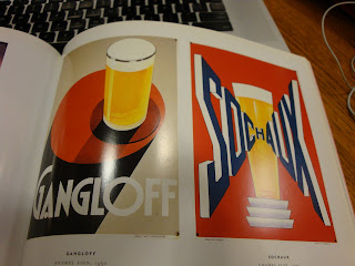
French Deco


I was given this book the other day to research a project and I'm really liking the style of the early 20th century French Deco. French Deco is also known as French Modern and Art Deco. The style is seen as sleek and sophisticated and the book's introduction gives us an insight to the spirit of the time. "Graphic designers drunk with colors and shapes gave free expression to their wit and imagination...reaching new heights of visual excess and delightful eccentricity."
The book, French Deco - Steven Heller, is not available at the Parkland library, but I'm sure you can find most of the work within other books.
Here are some shots. Everything is so triumphant looking, so scaled in perspective and has a worn, yet spirited feel (it is from the 20's and 30's).
Enjoy.